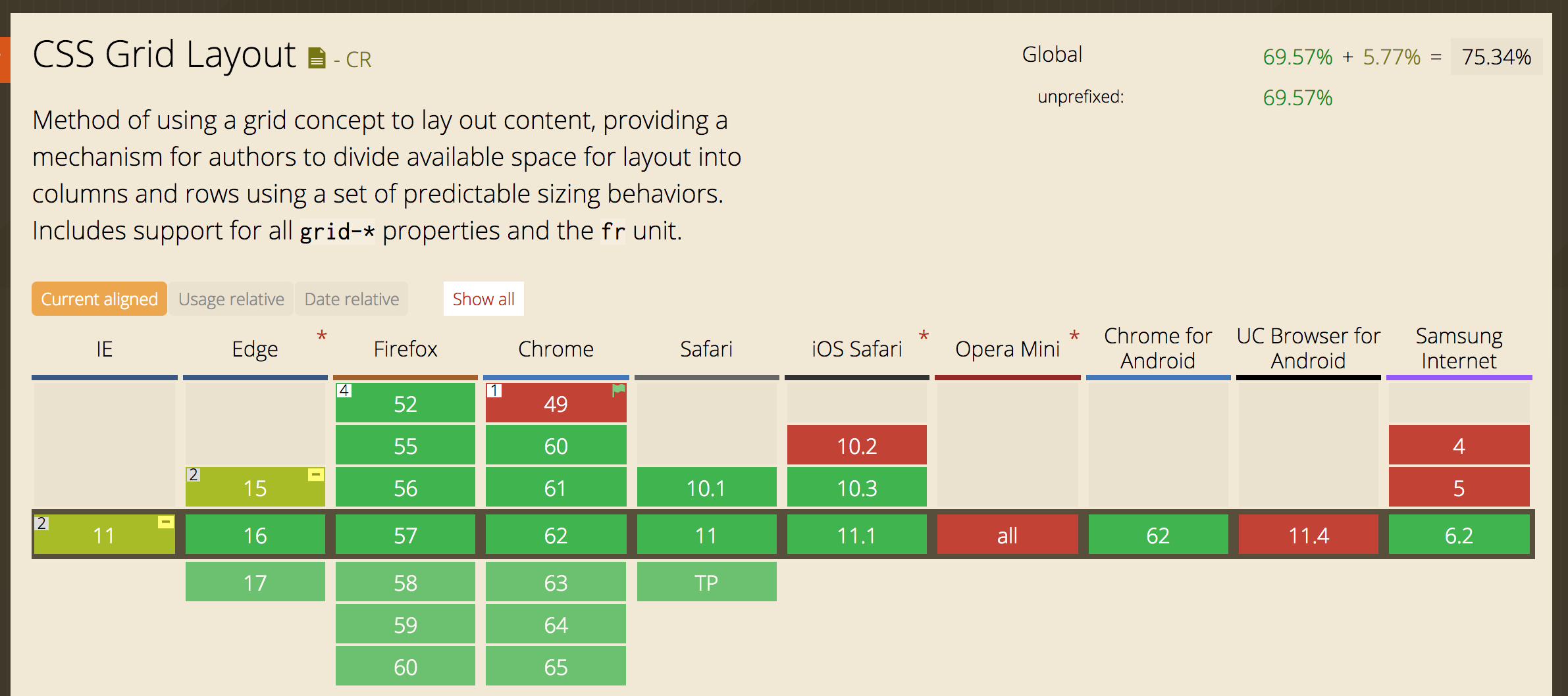
浏览器支持率
在 Can I Use中搜索结果:
一些术语
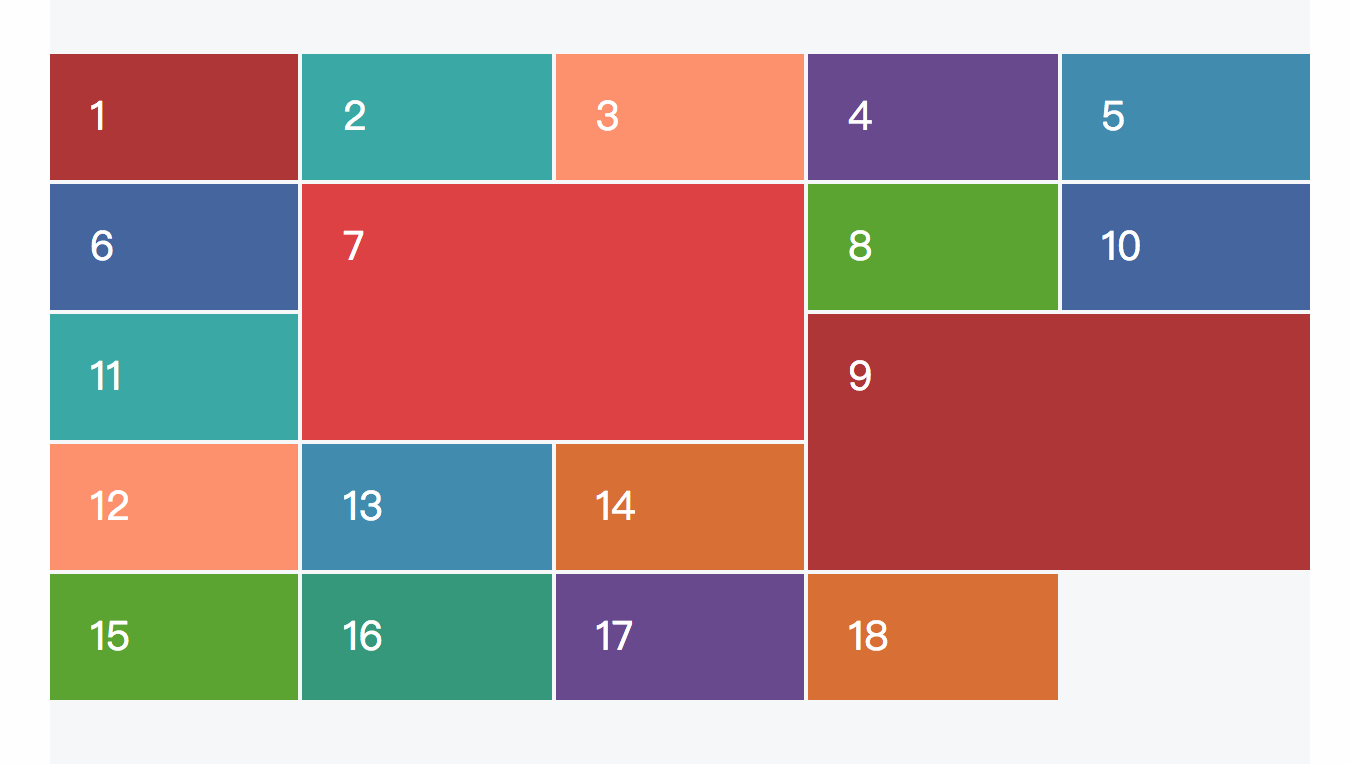
网格线、行、列、单元格

在上图中,各数字表示的是:
- 网格线
- 列
- 行
- 单元格
间隙gutters
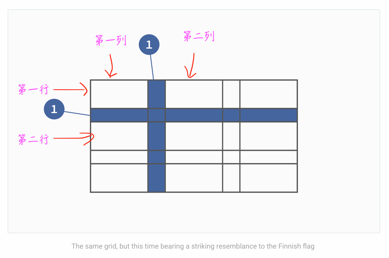
很多时候行与行、列与列之间并不是紧挨着的,中间会留有一些间隔。在上图中的加深区域就是这些间隙。
网格区域

表示由任意4条网格线围起来的区域,内部可以包含任意数量的单元格。
CSS GRID属性
以下均用这段html结构作为示意
1 | <section class="grid-1"> |
display: grid;
1 | .grid-1 { |
表明是网格布局。
grid-template-columns、grid-template-rows
用于定义有多少行、多少列。
1 | .grid-1 { |
第一列宽度150px,第二列宽度20px,以此类推,每一行也是类似。auto值表示行的高度由内容决定。
这里的值也可以用百分比表示:
1 | grid-template-columns: 33.33% 33.33% 33.33%; // 加起来需要为100% |
grid-column、grid-row
定义单元格的位置
1 | .item-2 { |
表示此单元格处于第一行第三列。
repeat()
用于消除重复劳动的便利函数:
1 | grid-template-columns: 33.33% 33.33% 33.33%; // 加起来需要为100% |
可以改写为
1 | grid-template-columns: repeat(3, 33.33%); |
grid-column-gap、grid-row-gap、grid-gap
定义间隙的属性,如
1 | grid-gap: 20px; // 简写属性 |
表示行和列的间隙都是20px;
fr
表示分数,用于定义每一行或列占总数的多少。
1 | grid-template-columns: 1fr 1fr 1fr; //表示每一列占`1/3` |
1 | grid-template-columns: 2fr 1fr 1fr; // 第一列占1/2,其余各占1/4 |
可以和其他单位混合使用
1 | grid-template-columns: 300px 1fr 3fr 20%; |
第一列固定300px; 最后一列占总宽度的20%,剩下的宽度中,先减去3条间隙的总宽度,然后第二列占剩下的1/4,第三列占3/4.
定义网格区域
网格布局中每一个并不是只能占据一个单元格,其实可以把它定义成任意的网格区域。
1 | .item-1 { |

上面的数字1、3指的是每一条网格线的索引,有时候变换了布局时,重新计算开始和结束的索引可能不大方便,可以使用span,这样只用计算开始索引即可。
1 | .item-1 { |
可以不用定义索引起点,直接定义span,这样表示此单元在它本来的位置上占据多少:
1 | .item-7 { |
命名网格区域grid-template-areas、grid-area
每一个区域都可以有一个名字,这样在总体布局时就能直接使用这些名字,效率更高。
1 | .grid-1 { |
嵌套网格布局
默认情况下,网格布局只会影响到直接的子元素,而不会影响到更深层次的后代元素。
但是每一个网格区域本身也可以定义成网格布局,这样它内部的元素就能使用所有的网格布局属性了。
例如以下结构:
1 | <section class="grid-1"> |
可以把item2弄成嵌套的网格布局
1 | .item-2 { |
响应式的网格布局
需要借助媒体查询:
1 | .grid-1 { |
例如
1 | .grid-1 { |
这些布局不会影响到嵌套的网格区域,所以如果嵌套的网格区域也需要响应式,同时要像上面一样分开写。
auto-fill
用于告诉网格处理器每一个单元格有多宽,让网格处理自己去决定每一行放多少个单元格。
1 | .grid-1 { |
在算每行能放多少个单元格时,会把间隙的宽度也考虑进去的。
minmax()
告诉网格处理器每一个单元格的尺寸是在一个范围之内的。
1 |
|
表示第一列占1/3,第二列占1/3,第三列最少160px,最多1/3.在缩放浏览器的尺寸时,每一列都会跟着缩放,但是第三列最低只能缩到160px。
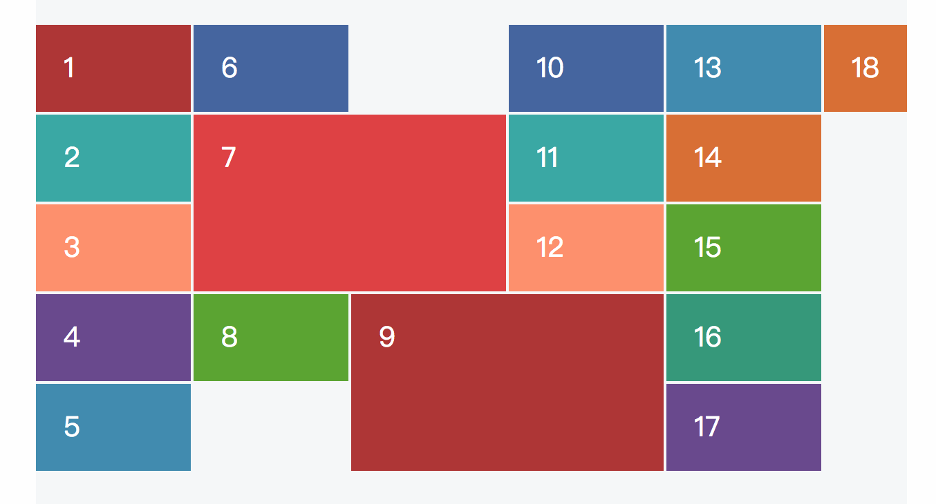
网格布局的自动布局机制
grid-auto-flow
默认的,网格布局会将每个单元格从左到右依次排列,如
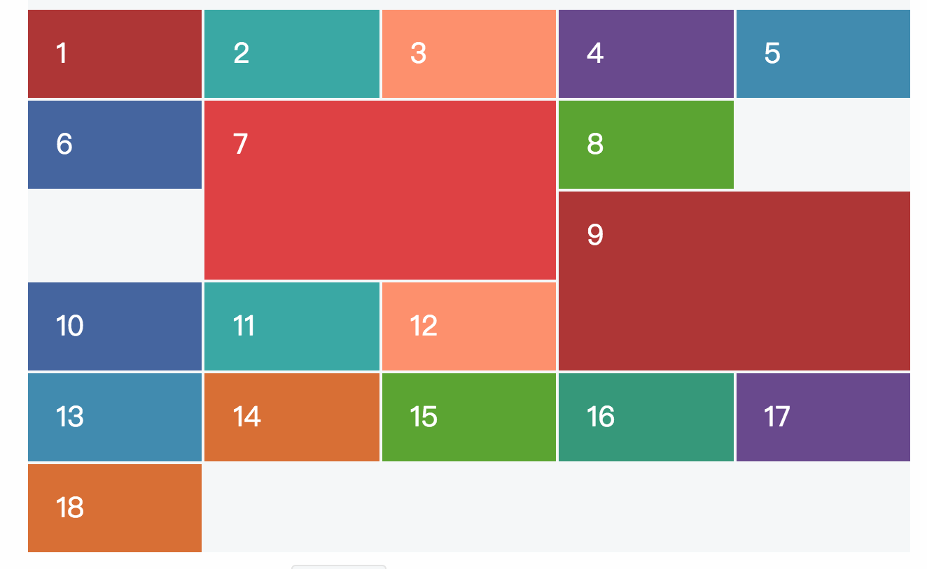
可以改变这个顺序,让它从上到下排列:
1 | .grid-1 { |
dense/sparse
告诉网格布局器是否应该将单元格紧密排列
1 | grid-auto-flow: row dense; // 默认是sparse稀疏 |
设置成dense,会自动调整布局,尽量占据在稀疏布局下不会占据的空间。
不过这样可能会导致DOM结构和页面展示的顺序不一致。
网格布局机制
- If we haven’t specifically defined an item’s location, Grid’s auto-placement algorithm will place it in the next available (and large enough) slot.
- Where there’s no available slot in the current row, it will begin searching the following row, even if that leaves gaps.
- We can switch this search order by altering grid-auto-flow from row to column.
- grid-auto-flow accepts a keyword to describe the “packing” approach. By default this value is sparse, but we can alter this to dense which attempts to fill in all available gaps.
bootstrap的网格系统
实现原理
通过定义容器大小,平分12份(也有平分成24份或32份,但12份是最常见的),再调整内外边距,最后结合媒体查询,就制作出了强大的响应式网格系统。Bootstrap框架中的网格系统就是将容器平分成12份。
工作原理
原理
数据行(.row)必须包含在容器(.container)中,以便为其赋予合适的对齐方式和内距(padding)。如:
1
2
3<div class="container">
<div class="row"></div>
</div>在行(.row)中可以添加列(.column),但列数之和不能超过平分的总列数,比如12.
1
2
3
4<div class="row">
<div class="col-md-4"></div>
<div class="col-md-8"></div>
</div>具体内容应当放置在列容器(column)之内,而且只有列(column)才可以作为行容器(.row)的直接子元素
- 通过设置内距(padding)从而创建列与列之间的间距。然后通过为第一列和最后一列设置负值的外距(margin)来抵消内距(padding)的影响
示范图
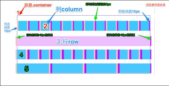
- 最外边框,带有一大片白色区域,就是相当于浏览器的可视区域。在Bootstrap框架的网格系统中带有响应式效果,其带有四种类型的浏览器(超小屏,小屏,中屏和大屏),其断点(像素的分界点)是768px、992px和1220px。
第二个边框(1)相当于容器(.container)。针对不同的浏览器分辨率,其宽度也不一样:自动、750px、970px和1170px。
1
2
3
4
5
6
7
8
9
10
11
12
13
14
15
16
17
18
19
20
21.container {
padding-right: 15px;
padding-left: 15px;
margin-right: auto;
margin-left: auto;
@media (min-width: 768px) {
.container {
width: 750px;
}
}
@media (min-width: 992px) {
.container {
width: 970px;
}
}
@media (min-width: 1200px) {
.container {
width: 1170px;
}
}
}2号横条阐述的是,将容器的行(.row)平分了12等份,也就是列。每个列都有一个“padding-left:15px”(图中粉红色部分)和一个“padding-right:15px”(图中紫色部分)。这样也导致了第一个列的padding-left和最后一列的padding-right占据了总宽度的30px,从而致使页面不美观
1
2
3
4
5
6.col-xs-1, .col-sm-1, .col-md-1, .col-lg-1, .col-xs-2, .col-sm-2, .col-md-2, .col-lg-2, .col-xs-3, .col-sm-3, .col-md-3, .col-lg-3, .col-xs-4, .col-sm-4, .col-md-4, .col-lg-4, .col-xs-5, .col-sm-5, .col-md-5, .col-lg-5, .col-xs-6, .col-sm-6, .col-md-6, .col-lg-6, .col-xs-7, .col-sm-7, .col-md-7, .col-lg-7, .col-xs-8, .col-sm-8, .col-md-8, .col-lg-8, .col-xs-9, .col-sm-9, .col-md-9, .col-lg-9, .col-xs-10, .col-sm-10, .col-md-10, .col-lg-10, .col-xs-11, .col-sm-11, .col-md-11, .col-lg-11, .col-xs-12, .col-sm-12, .col-md-12, .col-lg-12 {
position: relative;
min-height: 1px;
padding-right: 15px;
padding-left: 15px;
}3号横条就是行容器(.row),其定义了“margin-left”和”margin-right”值为”-15px”,用来抵消第一个列的左内距和最后一列的右内距。
1
2
3
4.row {
margin-right: -15px;
margin-left: -15px;
}将行与列给合在一起就能看到横条4的效果。也就是我们期望看到的效果,第一列和最后一列与容器(.container)之间没有间距
- 横条5只是想向大家展示,你可以根据需要,任意组合列与列,只是他们的组合数之和不要超过总列数
参考资料
css grid一个系列文章